What unites Ferrari, Hermes, Burberry and Dallas Maverick? Popularity of the brand? Big money? Not only. All these companies and dozens of others have horses on their logos.
Hundreds of years ago knights put pictures of rearing horses on their coats of arms in a hope that it would bring them luck, success and glory in tournaments and on the battlefield. Today companies fight for the attention of customers and market share in showrooms, on shelves and, occasionally, in courts. So let’s see what the herd of logos looks like. I deliberately didn’t include some very well-known and beautiful logos of equestrian companies like Pikuer, FEI, British Dressage, etc. The following 30 brands do not specialize in horse-related industries. Well… At least they don’t nowadays.
Transportation sub-herd

-
Ferrari – #98 best global Brand 2013 – arguably the most famous horse brand. Enzo Ferrari told the story of the prancing horse logo just once: The horse was painted on the fuselage of the fighter plane of Francesco Baracca – a heroic airman of the First World War. In 1923, I met count Enrico Baracca, the hero’s father, and then his mother, Countess Paulina, who said to me one day “Ferrari! Put my son’s prancing horse on your cars. It will bring you good luck.” The horse was, and still is, black, and I added the canary yellow background which is the color of Modena.
-
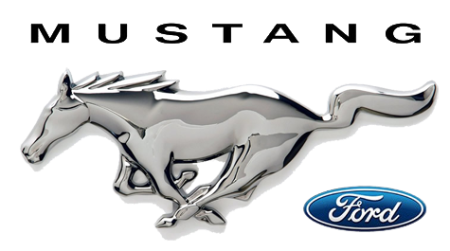
Mustang – Created in 1964 as a car for baby boomers, there was an equal chance of it being named Cougar, so there was serious possibility for us to live in the world with puma cars, not pony cars :-). There are many theories why the horse was depicted running from right to left. The most popular ones: 1) the designer, Phil Clark, was left handed and drew the logo the way that was natural for him; 2) the mustang is shown running in the opposite direction that racehorses run around a track, as a symbol of free spiritedness; 3) the most interesting, yet most unlikely, is the story that the logo was originally drawn running from left to right, but was reversed when it was used to mold the physical emblem.
-
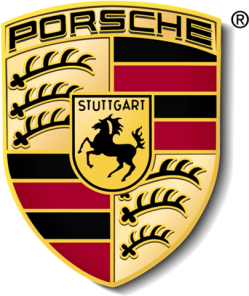
Porsche – #67 best global Brand 2013. You may not believe it, but Ferrari’s and Porsche’s horses might be long-lost-cousins. A theory suggests the Italian ace Baracca copied his horse design from a shot-down German plane with the emblem of the city of Stuttgart on it. And Porsche borrowed its prancing horse logo from the Stuttgart emblem. And what is more interesting is Stuttgart derives from Stutengarten, meaning ‘Mare Garden’.
-
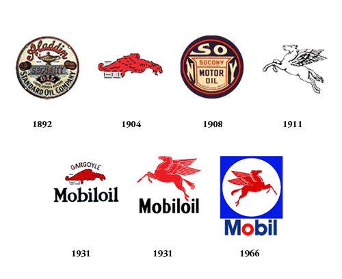
Mobil Oil – #47 in the list of most recognizable Brand logos of all time. Mobil is an oil company that has been in business for the last 120 years and during all these years has kept experimenting with their logo. I have no idea what the story is behind a dragon losing its battle to a winged horse, but I like it better this way :-)
-
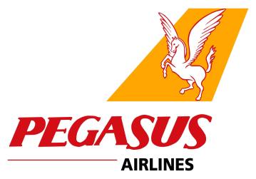
Pegasus Airways – One more flying horse, this time representing a Turkish low-cost carrier, established in 1990. The official site doesn’t shed any light on who came up with the idea of a pregnant Pegasus, but I guess there is a reason to keep it a secret :-)
-
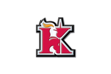
Knight transportation – An American company founded by four Knights brothers in 1990 has an amazing and memorable logo. What do you see? A letter K, a knight, a horse? Cool, right?
-
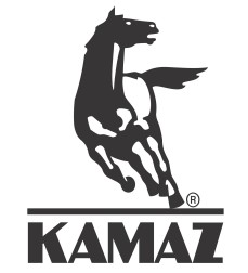
Kamaz – Probably the only brand the Russian car manufacturing industry can still be proud of. The Russian team driving Kamaz trucks had won the Paris Dakar truck race 12 times since 1996.
-
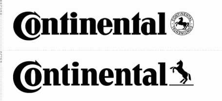
Continental AG – Another prancing horse, adopted by then called Continental-Caoutchouc und Gutta-Percha Compagnie as a trademark in 1882. Unfortunately, the initial powerful stallion doing levade lost some muscles with rebranding in 2013 and now looks rather like a playful yearling.
-
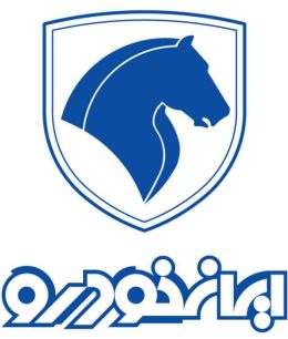
Iranian car brand Khodro – Kind of an orphan child in this sub-herd, but hey it’s still a horse, and we like all horses, don’t we?


Fashion sub-herd

-
Hermes – #54 best global Brand 2013. Did you know that Hermes started as a modest horses’ harness shop back in 1837? And now the iconic logo, created in the 1950s, is comprised of a Duc carriage attached to a horse, perhaps trying to remind us of the company’s humble origins. By the way, Hermes still produces horse riding equipment, including tack, which, knowing Hermes quality and attention to details, costs sometimes more than the average horse and looks more suitable in a modern art gallery than on a horse.
-
Levi’s – The old Levi’s logo, first used in 1886, consisted of two horses trying to tear a single pair of jeans, by pulling it opposite directions. Unfortunately, since 1940 the official version of the brand hasn’t included horses, but you still can see the old one on the back of Levi’s jeans sometimes.
-
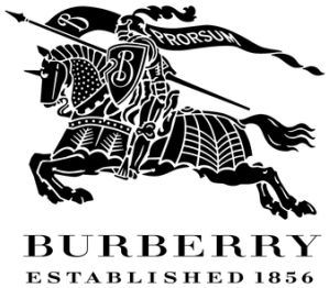
Burberry – The Burberry Equestrian-Knight-carrying-a-shield logo was created in 1901 and has never changed since, which is very unusual in the current era of logo simplification (just check Starbucks, Apple and Microsoft for comparison). Most likely you’ve never noticed it before, but there is a Latin word “Prosum” on the flag, which means ‘forwards’. And forwards it goes – in 2013 Burberry was ranked as # 77 best global brand.
-
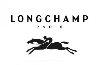
Longchamp – A 66-year-old French brand, which got its name from the racing track in Paris. You wouldn’t believe it, but the history of these gorgeous bags goes back to a small tobacco shop inherited by Jean Cassegrain in 1948. He started to cover the pipes he sold in leather, and soon enough such pipes become a luxury item, which could be bought only in his shop. Eventually, the company expanded to bags, wallets, and other leather accessories.
-
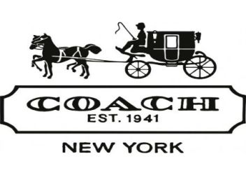
Coach – The logo was designed in 1962 by Bonnie Cashin, a legendary American artist and fashion designer who also created many influential handbag designs for the company.
-
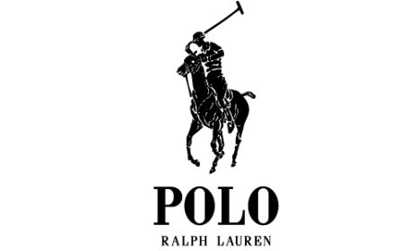
Ralph Lauren Polo – And now let’s have a look at our polo arena. As you may expect polo brands are very competitive. Ralph Lauren Polo was established in 1967, and today it is registered in over 70 countries of the world.
-
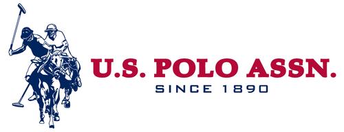
USPA – Does the USPA logo look similar to Ralph Lauren one? Ralph Lauren lawyers think it does, and in the world of marketing it is called a “confusingly similar trademark” and is a big no-no. That’s why for the last 30 years these two companies have regularly met in court arguing over very complicated issues like is it ok for USPA to use the word POLO on their shirts and perfume bottles, which is funny because the USPA (U.S. Polo Association) was initially established in 1890 as a sport organization and obviously has a stronger connection to actual polo than the Ralph Lauren fashion brand. :-)
-
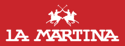
La Martina – In fact it’s the only Argentinian luxury brand recognized all over the world. Unless, of course, you count Lionel Messi as a brand. :-) Despite the majority of people now knowing La Martina as a fashion brand, it still produces polo uniforms, and sponsors the best polo team in the world. Of course it’s team Argentina!
-
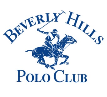
BHPC (Beverly Hills Polo Club) – Created in 1981, another polo brand which became popular among… Well, rather polo watchers than polo players.


Entertainment sub-herd
-
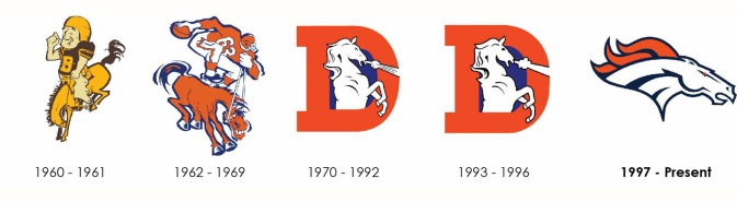
Denver Broncos – The Broncos’ logo has quite a busy and colorful history. The first version was created in 1960 depicting a hefty fellow on a tiny horse. Looking at the second version of the logo we may say that the new designer had a slightly better understanding of the laws of perspective and maybe even saw a real horse a few times(!) Then for a long 30 years the team was represented by a white horse having something protruding from his nostrils, until it was finally rebranded again in 1997 to become one of the most recognizable logos in the sport world.
-
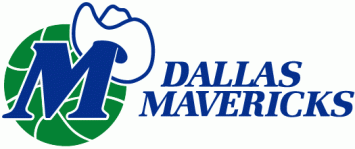
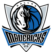
Dallas Mavericks – The NBA 2010-2011 champions changed their original inexpressive cowboy hat logo to the edgy frowning horse in 2001. By the way, check out the ‘M’ for Mavericks hiding on the horse’s forelock.
-
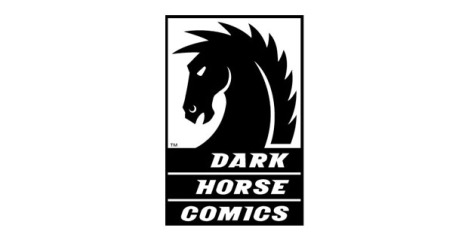
Dark Horse Comics – The 3rd largest comic book publisher in the US, whose current publications include Star Wars, Buffy the Vampire Slayer, Conan, Hellboy and many others.
-
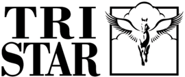
Tristar – Another Pegasus in our stable. The original logo was created in 1984 with the assistance of Sydney Pollack, and the horse in that logo was the same used in Pollack’s Oscar-nominated film ‘The Electric Horseman’. Could we maybe have a star on the Hollywood Walk of Fame for this horsey?
-
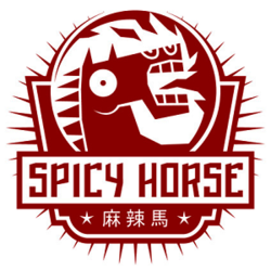
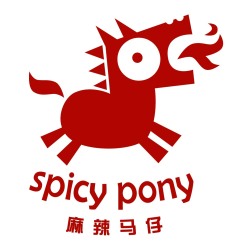
Spicy horse / Spicy Pony – These are two in one. The youngest brands in our collection belong to a Shanghai-based video game developer, established in 2007. Does this logo remind you of something? I have a strong feeling that the designer is a big fan of Picasso. Anyways, I just love these crazy creatures.

Drinkable sub-herd
Welcome to our bar. I was told that if you don’t want to get drunk, you need to gradually increase the strength of your drinks, so let’s get started…
-
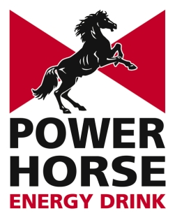
Power Horse. In the world where Red Bull has become a synonym of ‘energy drink’, it’s easy to forget that the Power Horse brand, which launched in 1994, was a pioneer among energy drinks. So when you drink Power Horse you drink a piece of energy drink history. Doesn’t it taste better now?
-
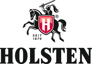
Holsten – The logo features a silhouette of a knight on a horse wielding a sword and a shield, with the letter ‘H’ on it. Whether the ‘H’ refers to Hamburg or to Holsten is anyone’s guess. The Holsten brewery was established in 1879, which means that it’s not the oldest one in Europe, but certainly old enough to proudly display the year on every can.
-
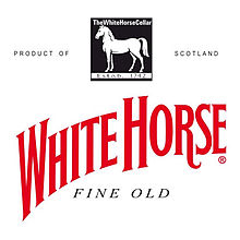
White Horse whisky – “The good guys are always on the White Horse” was the catchphrase from the late 1960s commercial of this “thoroughbred scotch” initially introduced in 1883. Mmm… Are they?
The last four are the odd ones out: a bank, a chocolate brand (yummy!), the oldest brand in our collection and a striped horsey.
-
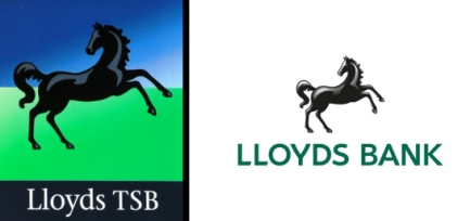
Lloyds Banking Group history began in 1765, which makes it the fourth oldest bank in the United Kingdom. According to the bank’s official site, like many other banking signs, ‘the black horse’ was inherited from goldsmiths – the forerunners of our modern banks. In the XVII century there were no street names and building numbers (mostly because of a largely illiterate society), so businesses used different symbols to attract the customers. Lloyds used to have a beehive as its sign, but after a merge with Barnetts, Hoares & Co in 1884, the signs of both companies were combined. Later the logo was updated a few more times, the latest being just last year.
-
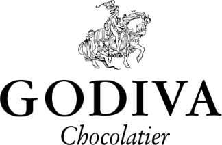
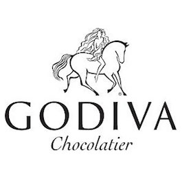
Godiva has been a premier Belgium chocolate maker since 1926. The name of the company was taken from the famous story of Lady Godiva. The logo went through rebranding, and a noble XI century woman sitting side-saddle on the old logo turned into a much more modern young hippie-like free spirited girl riding her horse bareback astride. Not sure which of these 2 logos I like more.
-
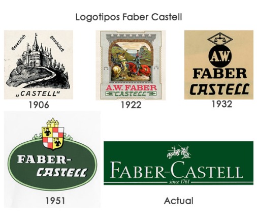
Faber Castell – Actually, this is the oldest brand in our stables and a beautiful addition to other knights in our collection. Faber Castell is the one of the world’s largest manufacturers of pens, pencils and other office supplies. Would you believe it is still run by an eighth generation direct descendant of Kasper Faber, who established the company in 1761?
-
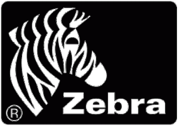
Zebra Technologies – You may not know it, but we all encounter this company’s products at least a few times a day. Whenever you see a sticker with a bar-code on it, you can be 90% sure it was printed by a Zebra printer. In fact, the history of this company deserves a Hollywood film adaptation, not less than Apple or Facebook, but this is another story :-)

Did I miss something? If you know another company with a horse logo that I forgot, feel free to mention it in the comment section. And if we have over 10-20 other ones, I will write about them in another post.

Just remembered 2 more logos: Three horses beer and DMC Corporation (Thread & Needlework supplies).
LikeLike
..because horses are awesome :)
LikeLike
Yeap, and bring your luck :-)
LikeLike
Pingback: Welcome to the August 2014 Blog Carnival of Horses | EQUINE Ink
Many thanks! :-)
LikeLike
ROYAL COUNTY OF BERKSHIRE POLO CLUB
LikeLiked by 1 person
Thank you! ;-)
LikeLike
Kent county council in England.. that is a white horse and is used by many organizations in Kent – the county cricket club, county fire service, police, as well as many small businesses who incorporate Kent or Invicta (which is Kent’s motto), into their name .invicta Mustangs ice hockey team get it double
LikeLiked by 1 person
Oh, thank you, Glen! Happy to add more pieces to my horse logo collection!
LikeLike